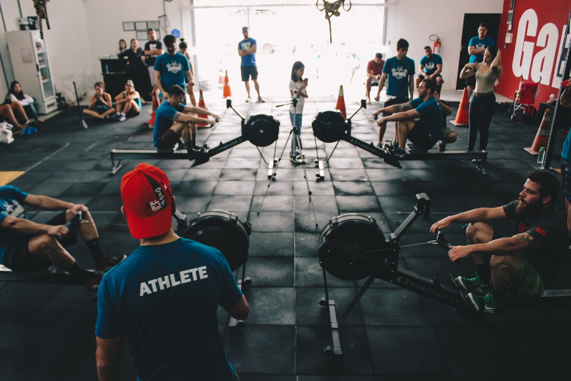
Design can entice, no one really likes going to the gym (however much they tell you they enjoy it) we would all rather stay in bed on those dark Sunday mornings than pump iron. If a gym is well laid out, bright and inviting then the thought of going on said Sunday morning doesn't seem all that bad.
Gyms have taken note of certain elements of the retail sector, companies like Halfords have invested millions into revamping their stores, not to change how they sell the products, but change the feel of the stores, the experience the customer has is just as important. Gyms have noticed this too and adapted, going to the gym is all about inertia, if you’re feeling good and know that the environment you’re working out in is designed in a manner that reflects this - that inertia continues.
Gym design is increasingly taking into account the added value that people expect, with so many low-cost gyms that have prices which are roughly the same, gyms have to work harder to convince people to join their gym.
For example, the Gym Group were one of the first gyms to offer 24/7 video-link pilates (for those of us who fancy a stretch at 4 in the morning). The heavyweights of the gym (pun absolutely intended, by the way), Pure Gym offer a 6-week course called Pure Loser, which invites people to lose weight through lifestyle changes and not just restrictive dieting.
You see, anyone can offer treadmills and dumbbells but not everyone can offer a consistent, high-value experience - that's where your trendy new gym comes in.
Social media is such an effective and cheap way to get your brand name out there, you’d be daft not to design your gym in such a way that it attracts attention on social media through the usual channels (Instagram and Snapchat in particular). If you create an environment that makes it easy for people to post about being at your gym, your marketing is virtually being done for you!
Restaurants like Dirty Bones in London have been built specifically with Instagram in mind (they even offer diners an Instagram kit to photograph their food - I can hear you all rolling your eyes) - but it works, at current count, there are nearly 10,000 posts with the hashtag #dirtybones. If you design your gym with this sort of Instagram-worthy aesthetic in mind you can almost guarantee you’re going to get the traction on social media that so many businesses crave.
Minimalism
One of the first trends to notice is minimalism. It's worked well in lots of hospitality zones and seems to be on trend in lots of gyms too. The key is (other than keeping things minimal, dur) to choose neutral tones when outfitting the walls, floor and ceiling which creates a clean and sophisticated look that focuses consumers on their goals, as opposed to distracting them with flashy neon annoyance.
Industrial
This is quite a popular one nowadays, I mean, who doesn't love some exposed brick! It sort of mirrors the rise of CrossFit which put functional training on the map, colloquially known as the sport of fitness. Today, this industrial look has been taken on by more mainstream gyms looking to offer a rustic look of exposed brick and wooden & copper fixtures.
Colour
The use of colour may only be seen as a way brightening a place up but its use is far deeper than that. Colour in gyms can motivate and set the tone for a particular area in a gym, such as red for when you’re doing intensive, demanding work like weightlifting. As well as bold colours, neutral tones are also good at setting a particular mood in yoga area and parts of the gym where a state of tranquillity is considered essential.
Fall in Love with your gym again
Are you considering refurbishing or gym or are about to open one that needs a new lick of paint? Here at Love Finance we specialise in gym refurbishments and can help you create a bespoke finance package that ensures you can realise your dream of a modern, well-designed gym. We also partner with industry leading suppliers whose experience in gym fitting is second to none.


